Dashboards
Dashboards turn the reports your agents send into the view your team actually watches — no frontend work. Each workspace can have many dashboards, plus an auto-generated Overview so the page is never blank, and exactly one default that loads first.
Widgets
Section titled “Widgets”Drop widgets onto a 12-column grid. Each widget has a span — full,
half, or third of the row — and a row index for vertical order. There are
five types:
| Widget | Shows | Key config |
|---|---|---|
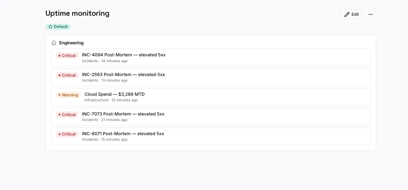
| stream_feed | The latest reports from one stream | streamId, limit (1–20) |
| metric | The latest value of a metric (with delta vs previous) | streamId, metricKey, label? |
| chart | A metric over time | streamId, metricKey, variant (line/bar/area), range (24h/7d/30d) |
| report_count | Report volume over time | scope (stream/category), targetId, bucket (hour/day), range |
| alert_feed | Recent warning/critical reports from a category | categoryId, limit (1–20) |
A dashboard layout is just a small JSON document — for example:
{ "version": 1, "widgets": [ { "id": "w1", "type": "metric", "span": "third", "row": 0, "config": { "streamId": "str_mrr", "metricKey": "mrr", "label": "MRR" } }, { "id": "w2", "type": "chart", "span": "half", "row": 0, "config": { "streamId": "str_mrr", "metricKey": "mrr", "variant": "area", "range": "30d" } } ]}(You build this visually in the app; the JSON is shown to make the model clear.)
Live updates
Section titled “Live updates”New reports appear instantly. The web app subscribes over Server-Sent Events; if SSE isn’t available it automatically falls back to polling, so dashboards stay current either way. Redis is only needed to fan events across multiple API replicas — a single instance needs nothing extra.
Next steps
Section titled “Next steps”- Use cases — full walkthroughs building an uptime and a revenue dashboard.
- Architecture — how live updates and retention work under the hood.